Bringing the Love to Dulux Most Loved Colours
Background
Faced with having to choose from Dulux’s vast range of colours, many DIY’ers can feel overwhelmed.
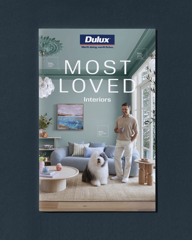
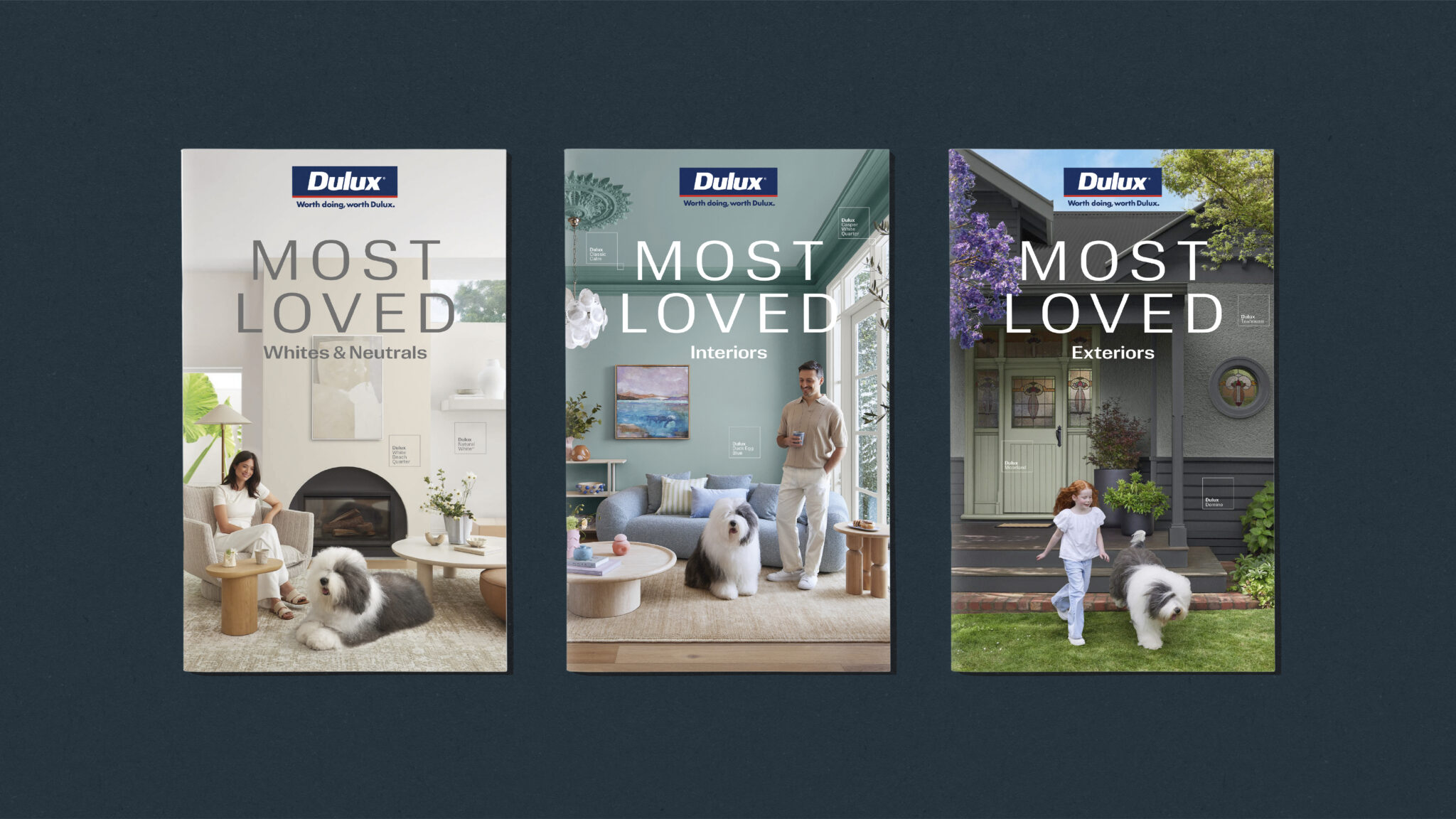
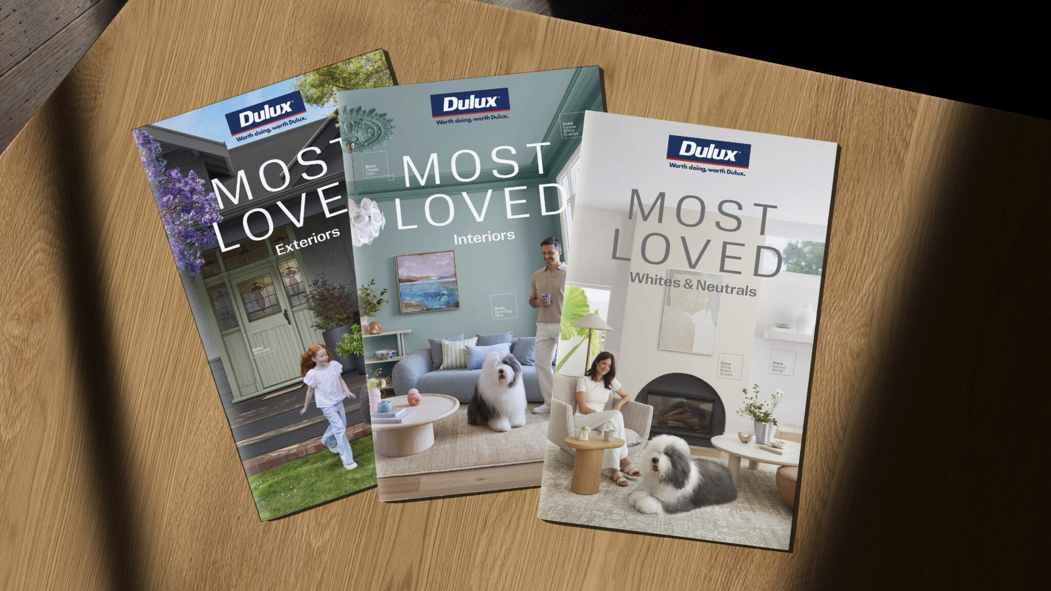
To make it easier, Dulux created a range of Most Loved Colours for the interior, exterior and for their whites and neutrals range. Now they needed a refresh.
Challenge
These brochures had an important job — stand out and inspire a decision. For an audience filled with uncertainty, we needed to produce more than a brochure. We needed to create confidence.
Solution
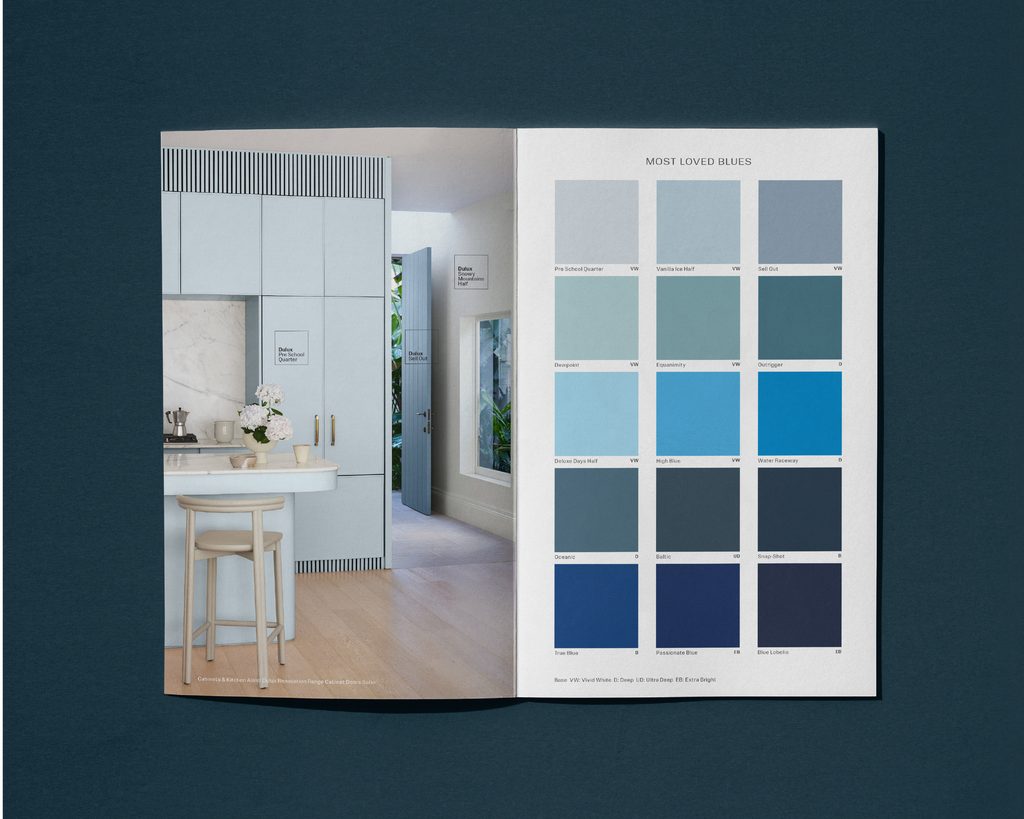
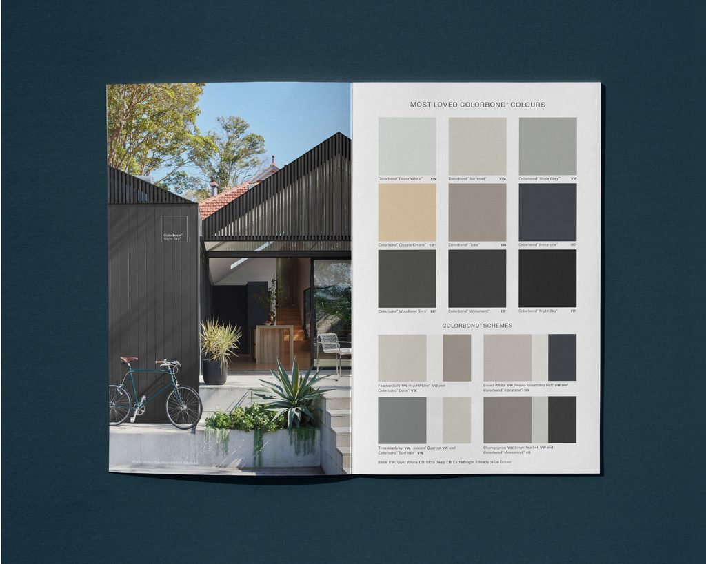
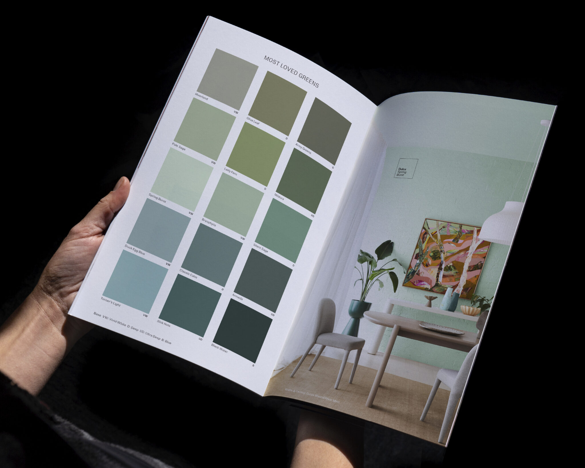
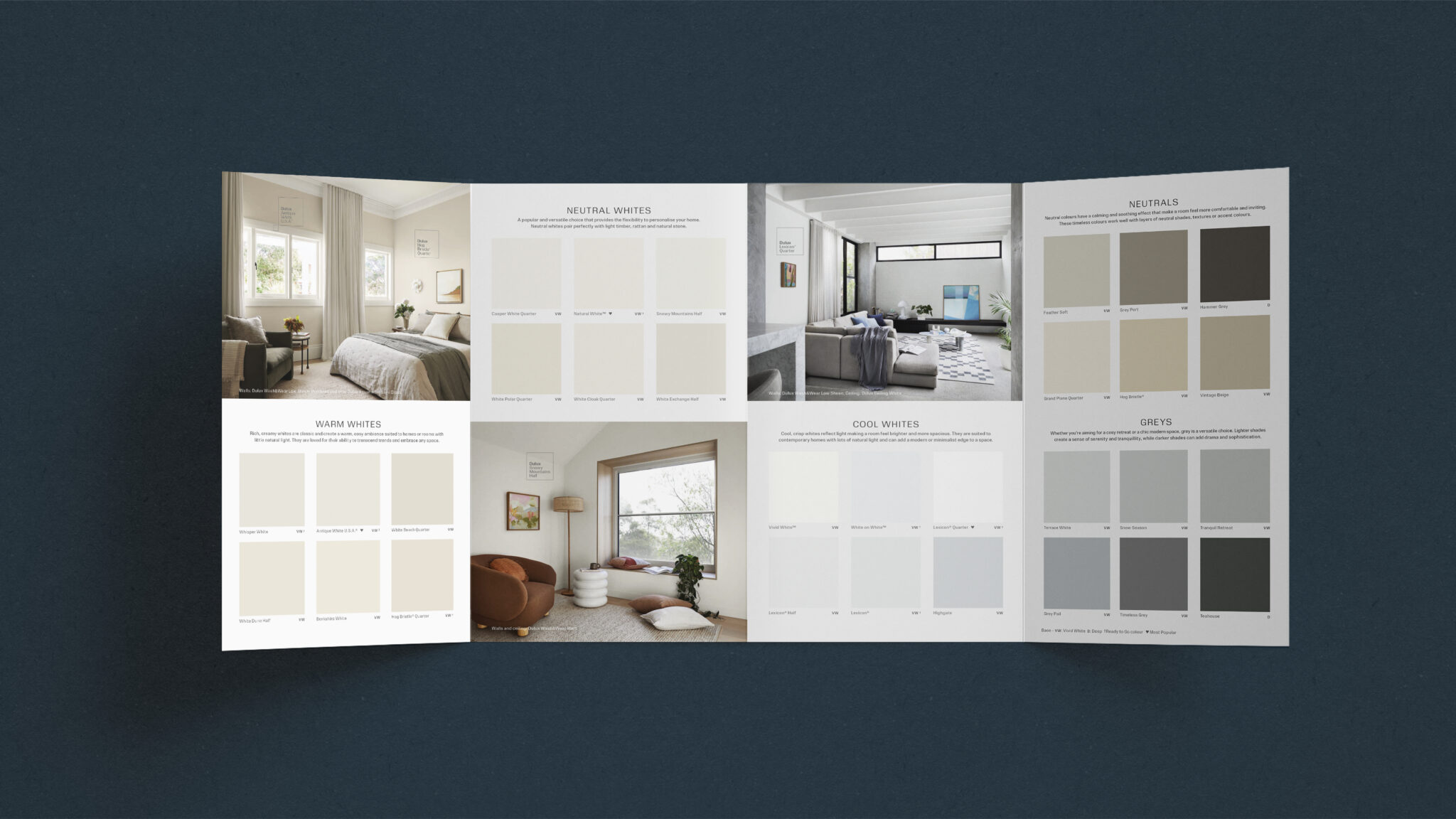
Collaborating with the Dulux team, we reviewed past brochures to see how we could make them simpler, clearer and more engaging.
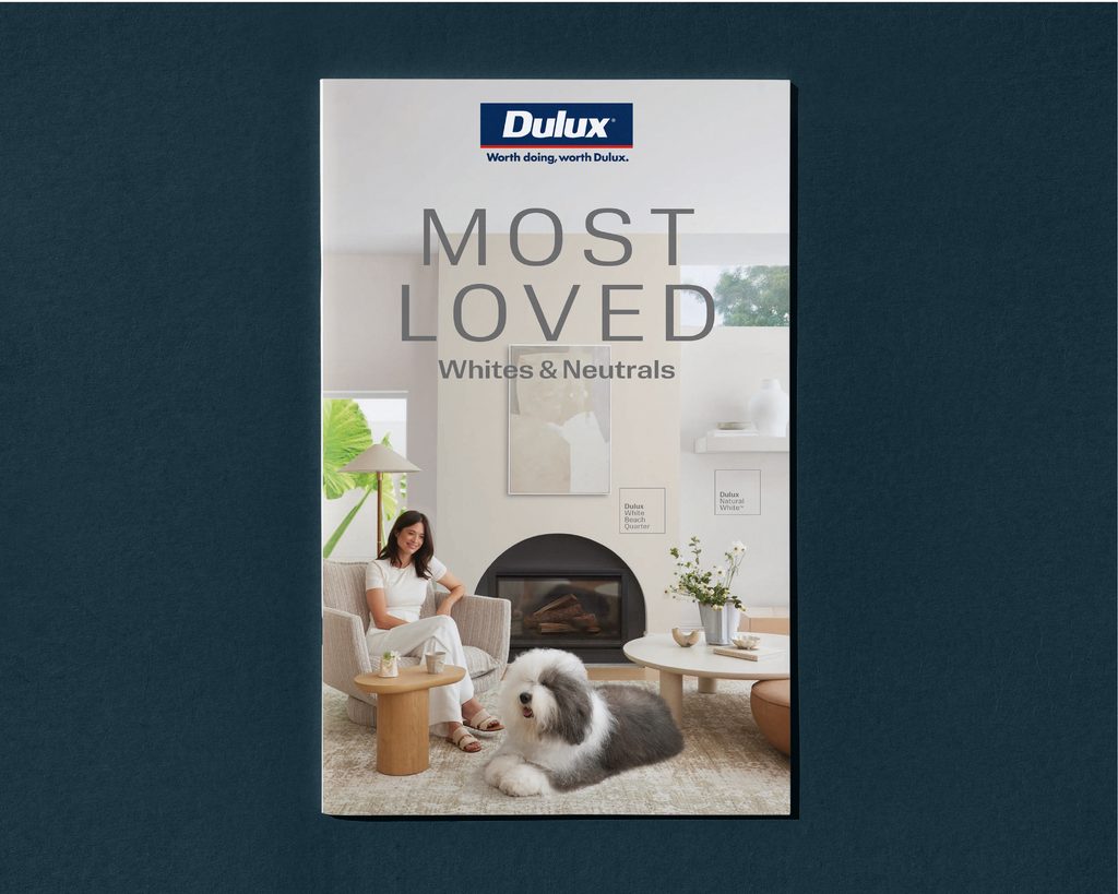
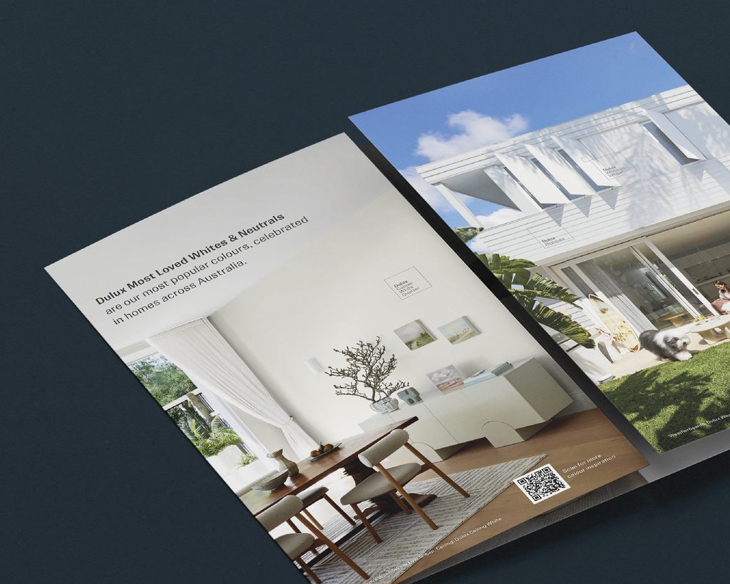
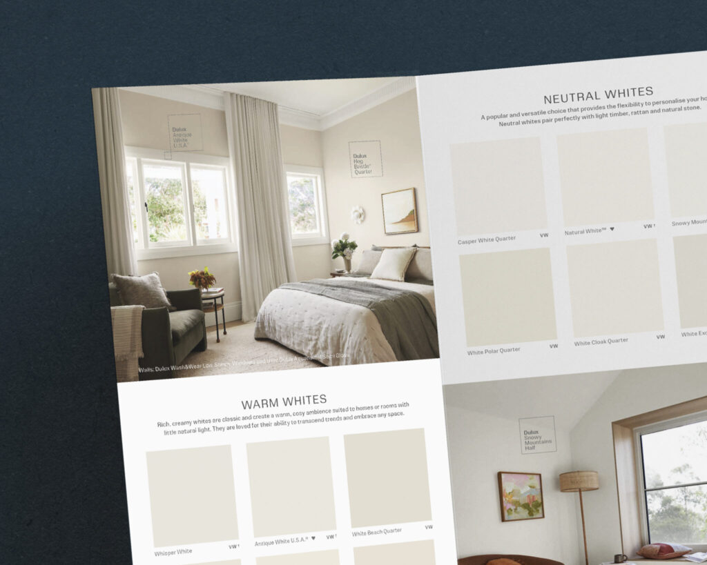
We gave the iconic Dulux dog some company, introducing people into the photography to help customers picture themselves in the spaces.
Across six shoot days in Sydney and Melbourne, we captured homes and interiors specifically chosen to truly bring the paint colours to life. From Californian bungalows to contemporary luxury, and from art deco to Scandi.
Importantly, we had to earn eyeballs. We knew these brochures would sit side by side beneath the Dulux colour card wall, so we made sure the design and colour palettes compliment each other.
Every decision served one purpose. Helping people find a colour they’d love, with confidence.
Scooter Difference
With our shopper expertise, we knew how to make every page work harder. We designed for the moment of choice – how people browse, what inspires them and what helps them decide.