A unified voice for millions of Australians

Overview
Following the merger of the Australian Institute of Superannuation Trustees and Industry Super Australia, Super Members Council was formed as a new national body representing the interests of members.
Scooter was engaged to develop the brand identity for this new organisation, bringing together two established voices into one clear and unified presence.
In a category often shaped by complexity and internal language, the opportunity was to create something more direct, human, and grounded in the people the system exists to serve.
The challenge
This was more than a rebrand. It was the creation of a new voice for the industry.
The identity needed to carry weight with the Federal Government, while remaining grounded in the needs of everyday Australians. It had to feel credible and authoritative without becoming political, and purposeful without drifting into abstraction.
At the same time, it needed to unify two legacy organisations into a single, clear position.
The insight
Superannuation is complex, but for members, the expectation is simple. It should work in their best interests.
The opportunity was to shift the organisation from an industry body to a clear advocate, speaking in a way that is easier to understand and harder to ignore.
This became the foundation for the brand. A more human, member-first voice that reflects who the system is ultimately for.
The strategy
The brand was built to express a collective voice, grounded in member outcomes.
Super Members Council was positioned as a trusted and politically neutral advocate, able to engage the Federal Government, funds, and members with clarity and confidence.
This meant simplifying how the organisation communicates, moving away from internal language and towards something more direct, considered, and accessible.

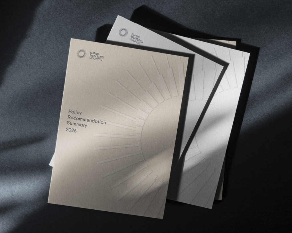
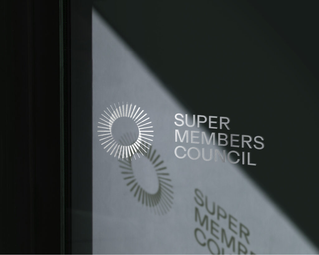
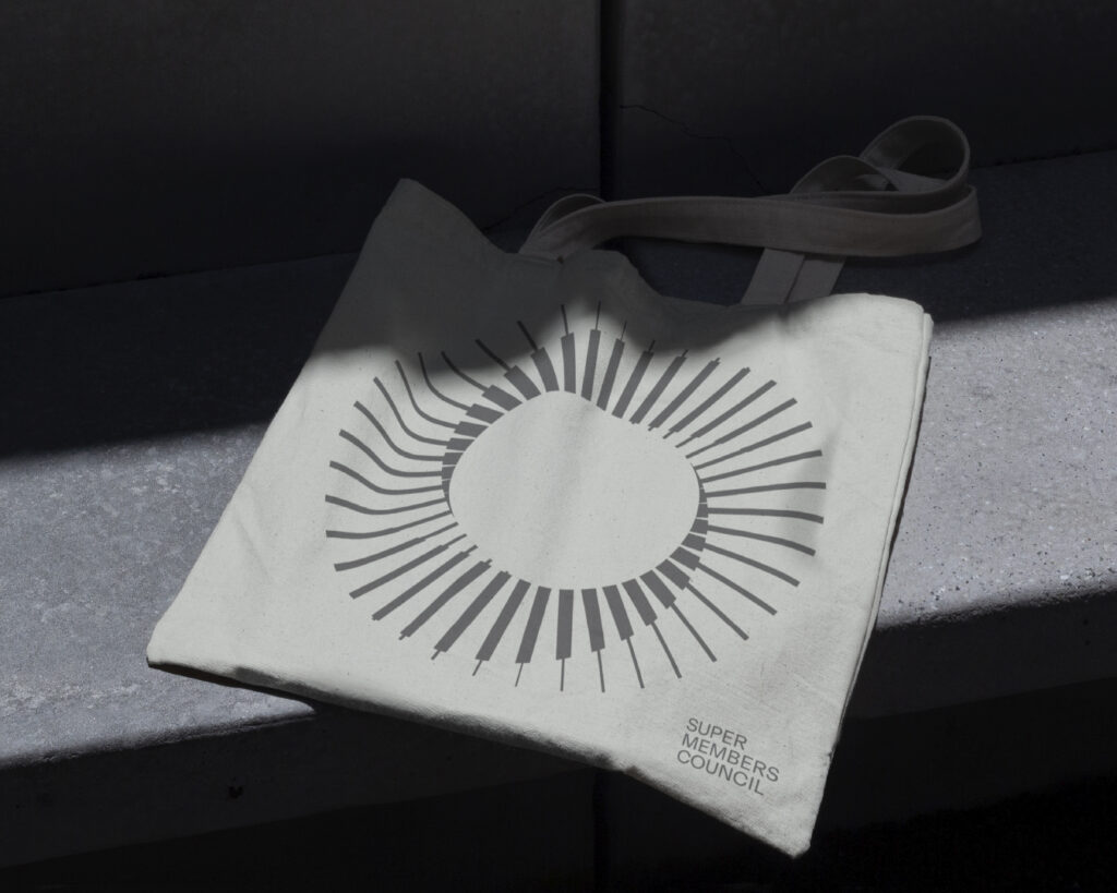
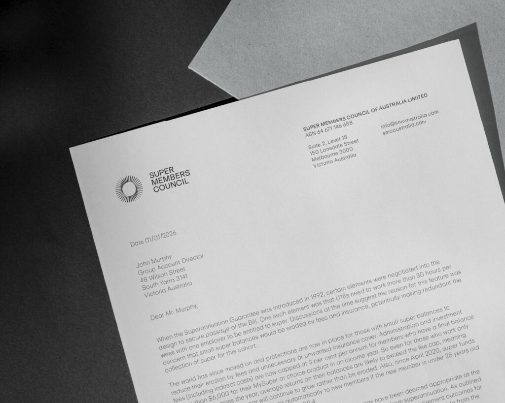
The identity
The identity balances authority with accessibility.
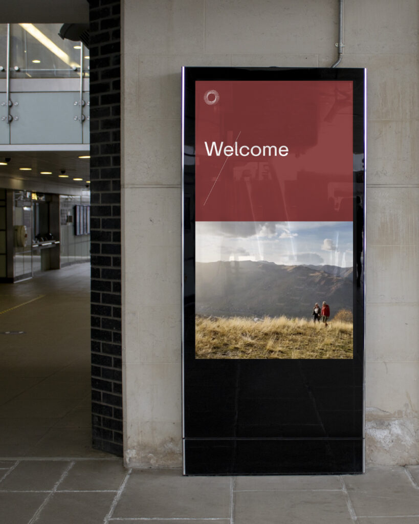
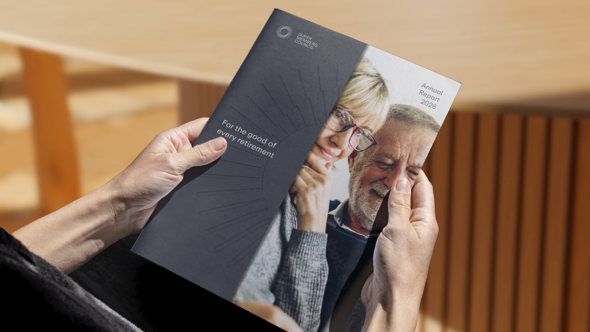
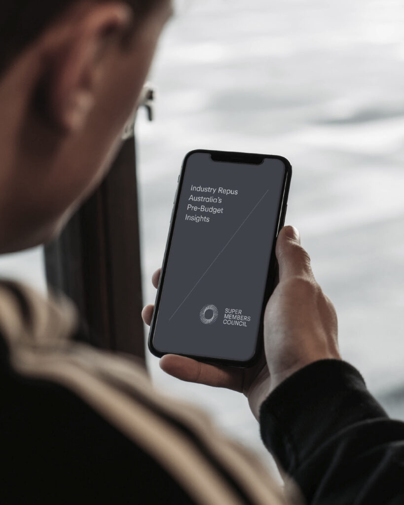
The brandmark draws inspiration from the Australian eucalypt flower, symbolising growth and resilience. Its linework reflects the diversity of members, while the circular form reinforces unity and connection across the system.
The visual system is deliberately restrained, using clean forms and a confident palette to create consistency across a wide range of communications.
Photography focuses on real Australians at different life stages, grounding the brand in lived experience rather than abstraction.
The outcome
Super Members Council launched with a clear and unified identity, establishing itself as a credible voice for millions of Australians and their retirement outcomes.
More than a visual system, the brand provides a consistent way for the organisation to show up across the Federal Government, funds, and members, supporting clearer communication and building trust over time.


The Scooter difference
We build brands from the inside out, grounded in insight, shaped by clear principles, and made to work in the real world.