DuluxGroup is more than a client – they’re a part of the Scooter DNA. Beginning the day we opened our doors in 2015, the partnership has continued to grow and develop into an ever-evolving collaboration with many of DuluxGroup’s brands.
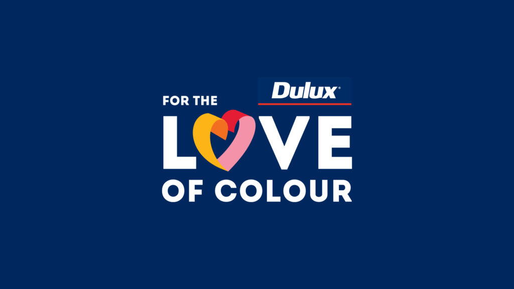
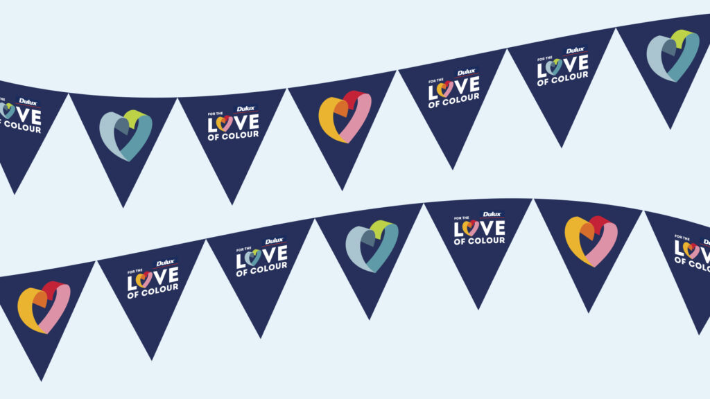
Dulux For the Love of Colour
Inspiring people to fall in love with colour again.
Overview
In 2023 Dulux celebrated its 25-year anniversary for Colour Forecast, demonstrating their longevity and commitment to being colour leaders.
To celebrate this occasion, Dulux wanted to bring its love for colour to the hearts and minds of their customers.
Challenge
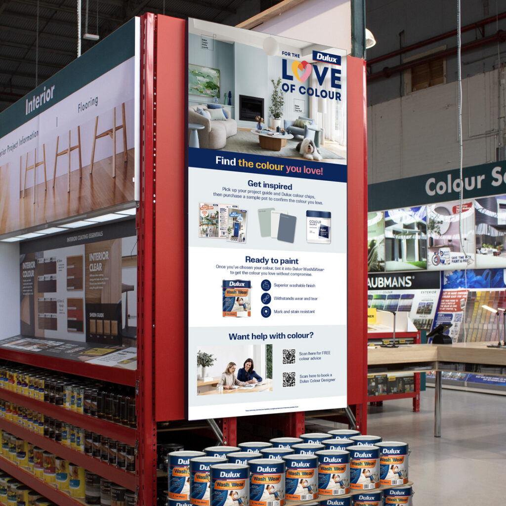
We were tasked with developing and executing a large-scale campaign concept that could be adapted across multiple in-store and digital channels.
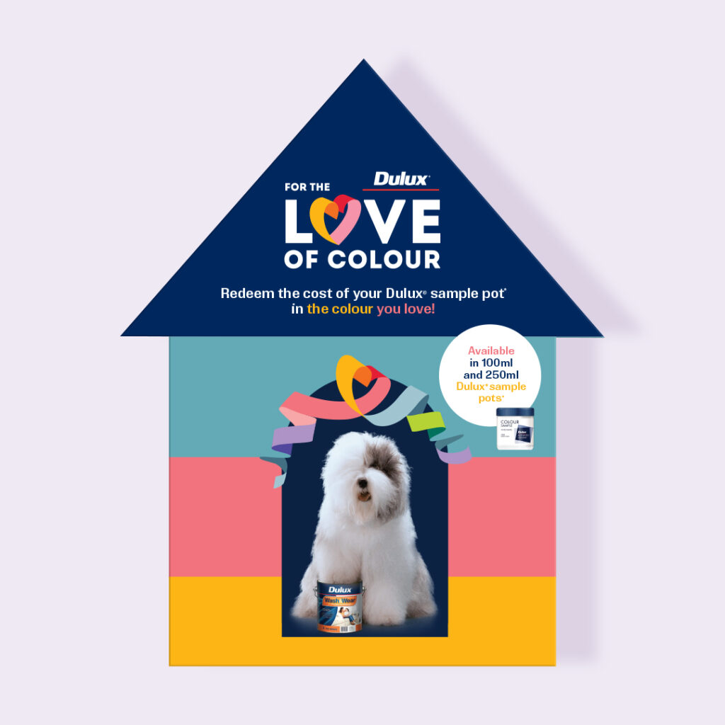
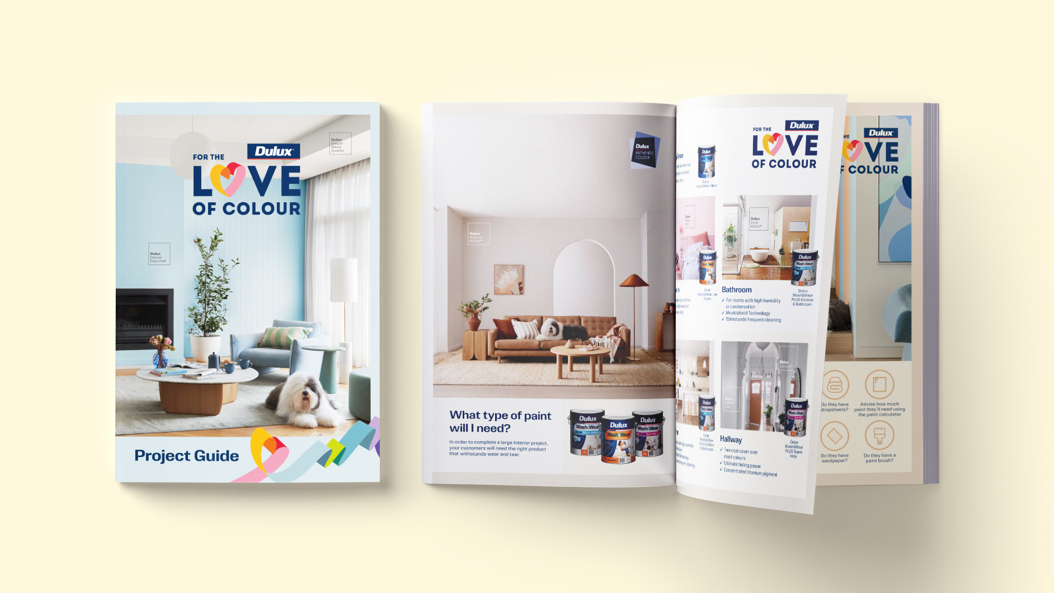
Our objective was to encourage consumers to trial colour with Dulux Sample Pots, while providing them with education and support throughout their colour journey.
Solution
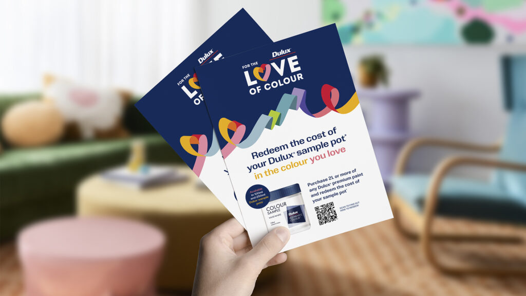
The creative we developed for the campaign was playful, light and most importantly – colourful! The free-flowing ribbon was a key campaign asset alluding to the endless colour possibilities you can find with Dulux.
The campaign was supported with a sample pot redemption offer to encourage the trial of colour. Alongside this, we promoted the many Dulux Colour Services available with QR codes for instant help with colour choice.
We rolled out in-store point-of-sale, digital, TV commercials, out of home and magazine ad placements, all with customised messaging to help customers at different touch points of their colour journey.
The campaign succeeded in celebrating colour while reinforcing Dulux’s position as the unrivalled colour leader.
Dulux
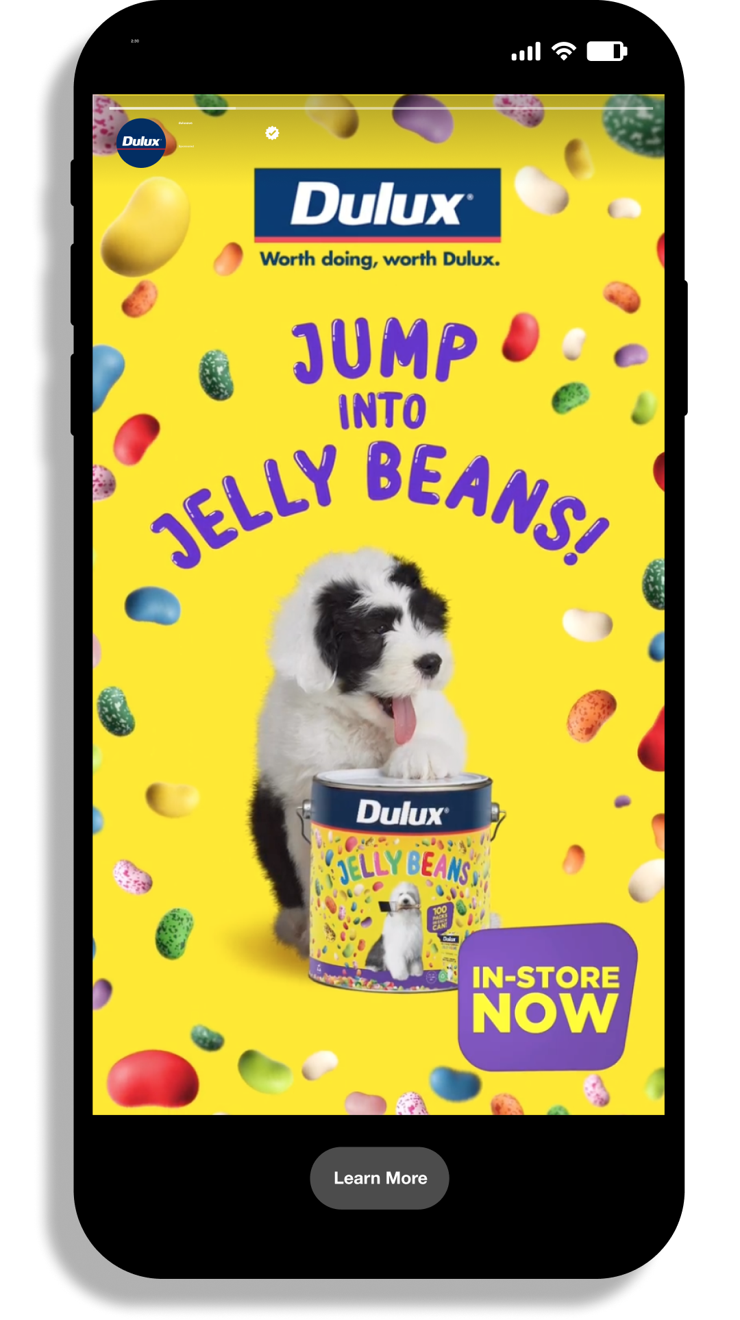
Bringing back the joy of Jelly Beans.
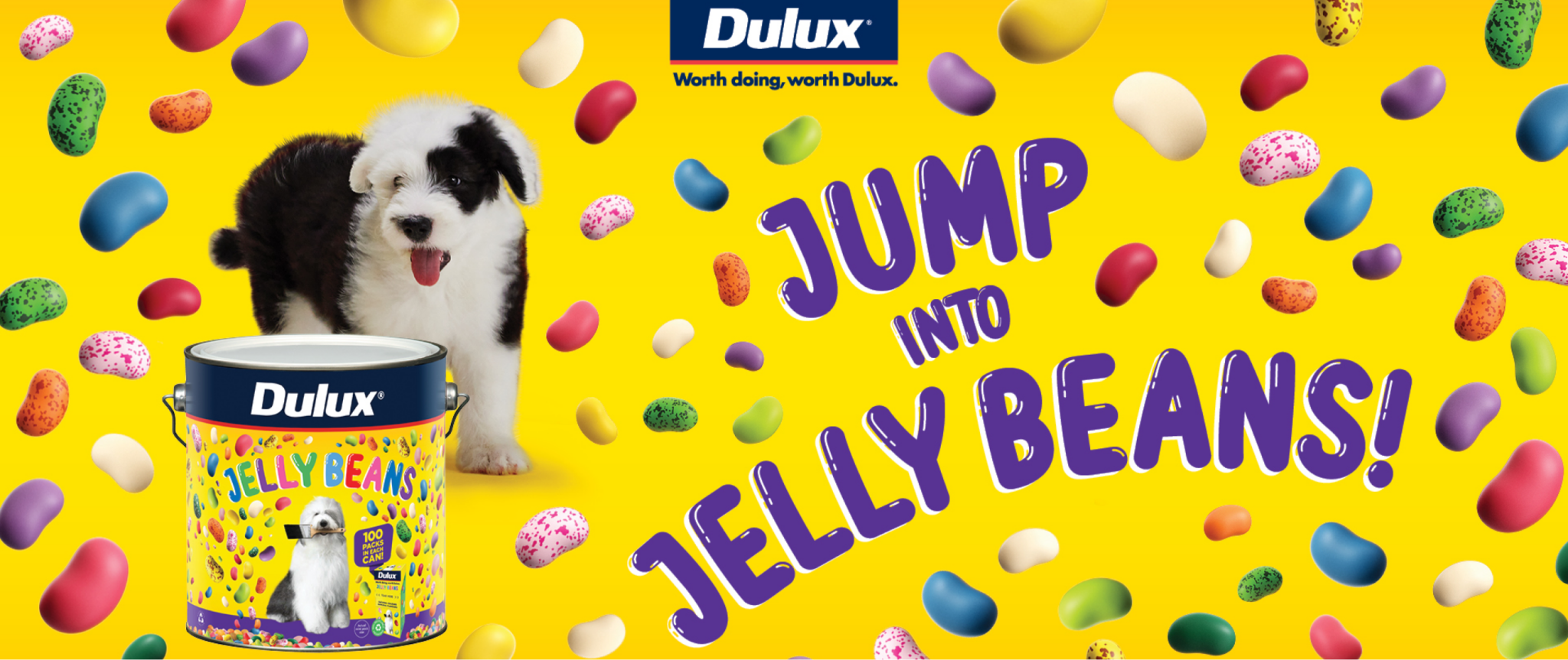
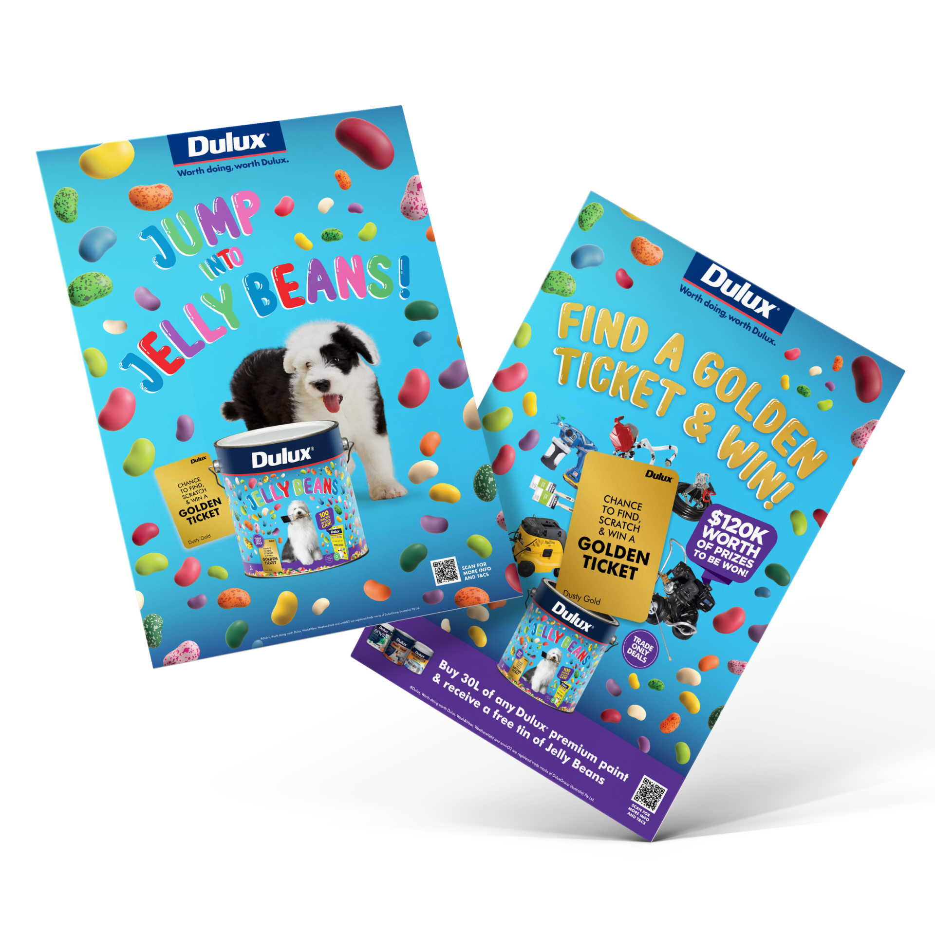
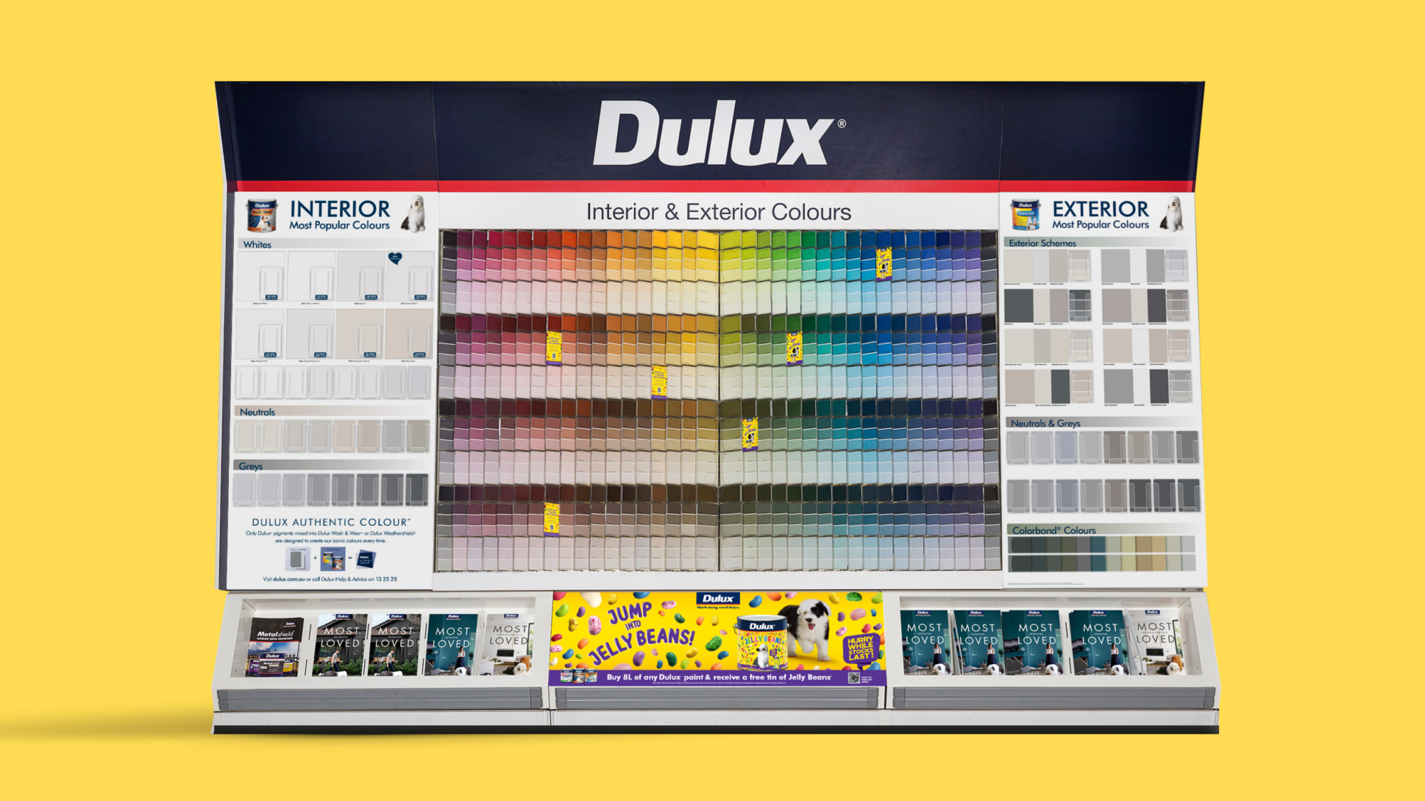
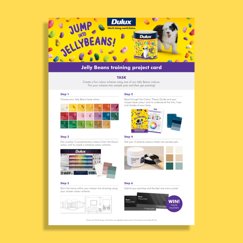
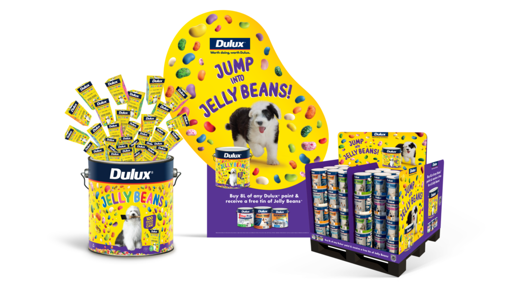
The Dulux Jelly Beans promotion or ‘Jelly Beans’ as it’s more fondly known as, has been bringing colour to Aussie lives for over 30 years. The challenge was to continue the momentum of previous years, develop more ways to extend and amplify the campaign and to prompt people to begin their DIY paint projects
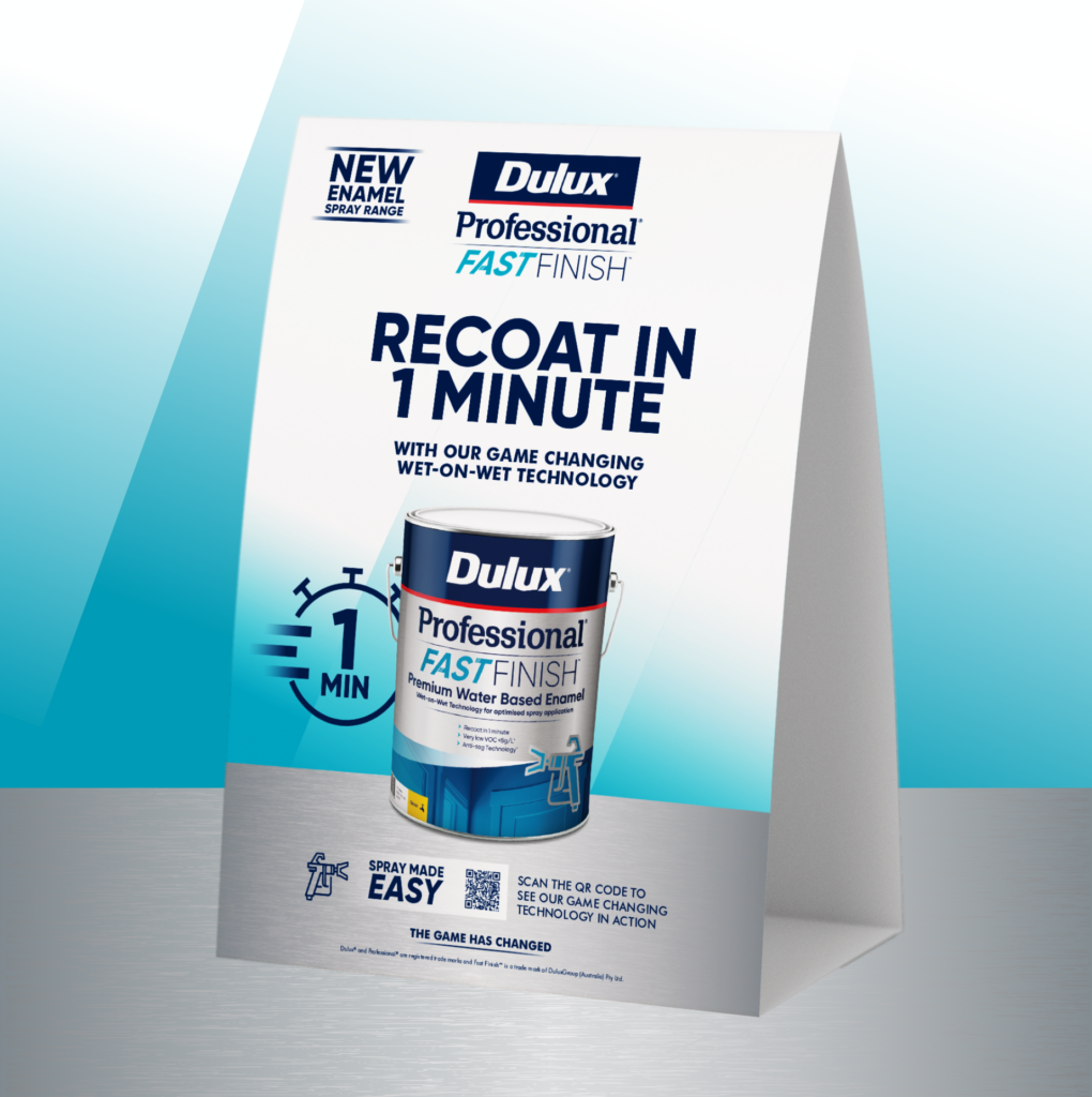
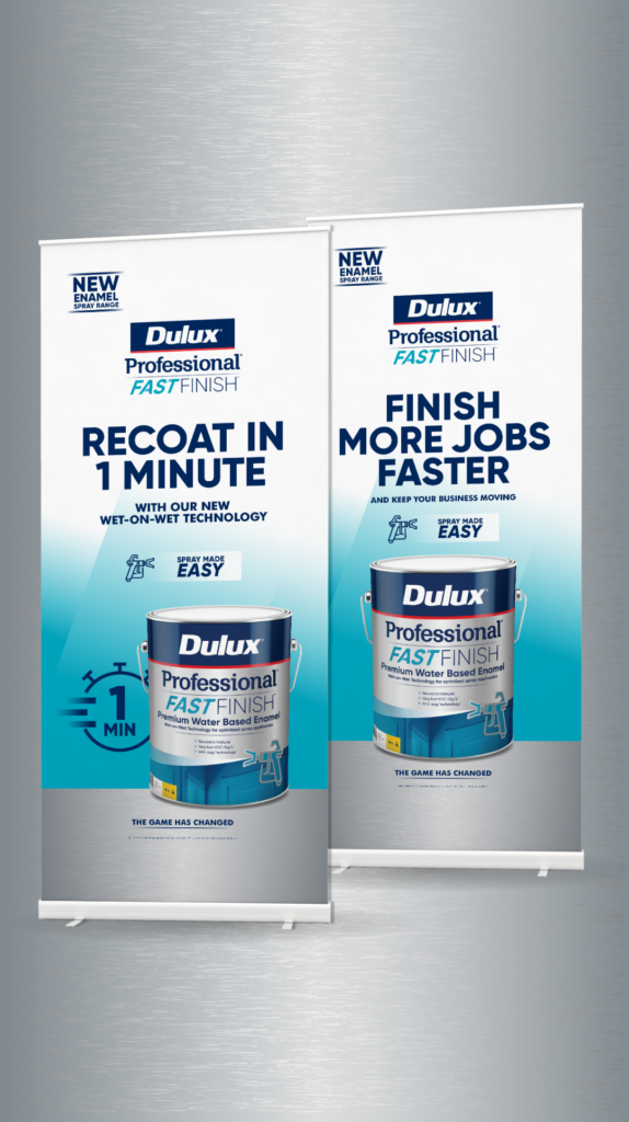
Dulux Professional Fast Finish
Introduce the game-changing Fast Finish range.
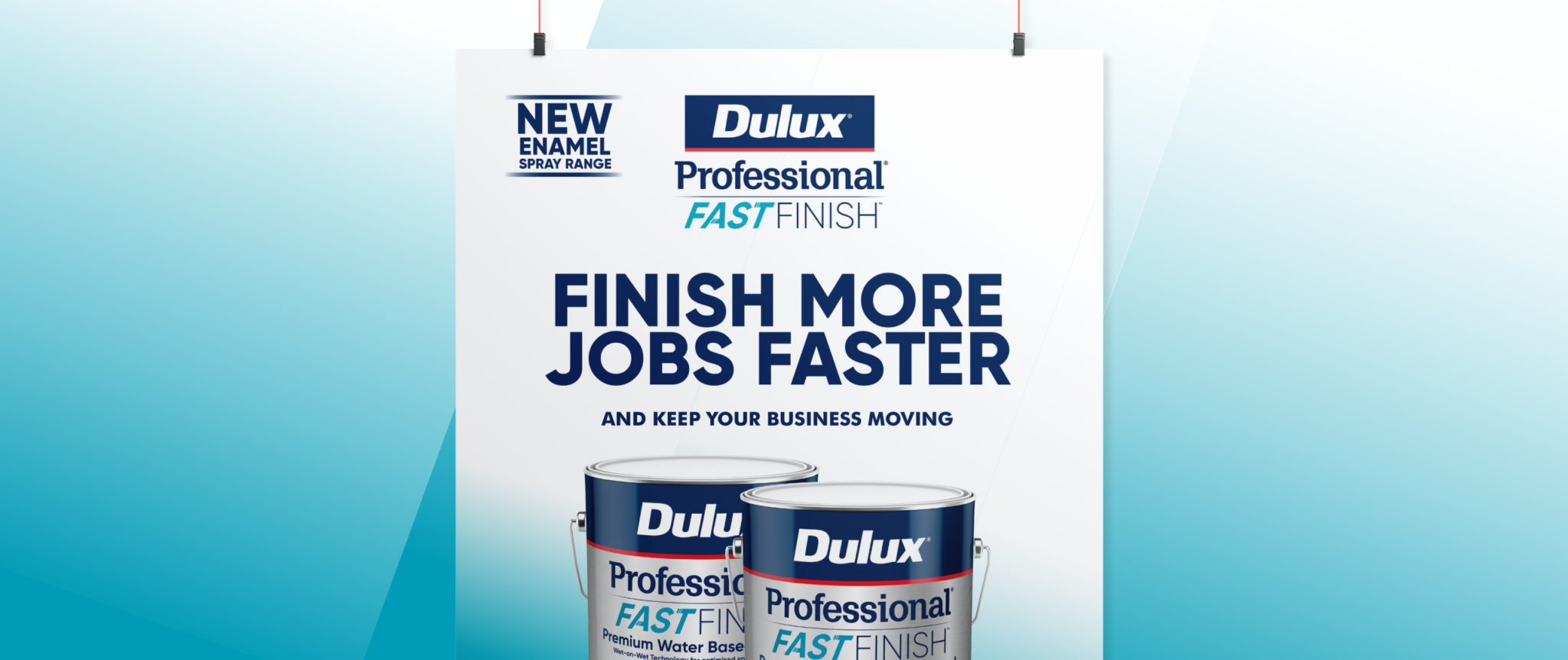
Dulux needed to launch the new Professional Fast Finish range to the trade painter market. We used compelling messaging, clever design and cut-through creative to convey the product’s game-changing productivity and efficiency.
Dulux needed to launch the new Professional Fast Finish range to the trade painter market. We used compelling messaging, clever design and cut-through creative to convey the product’s game-changing productivity and efficiency.
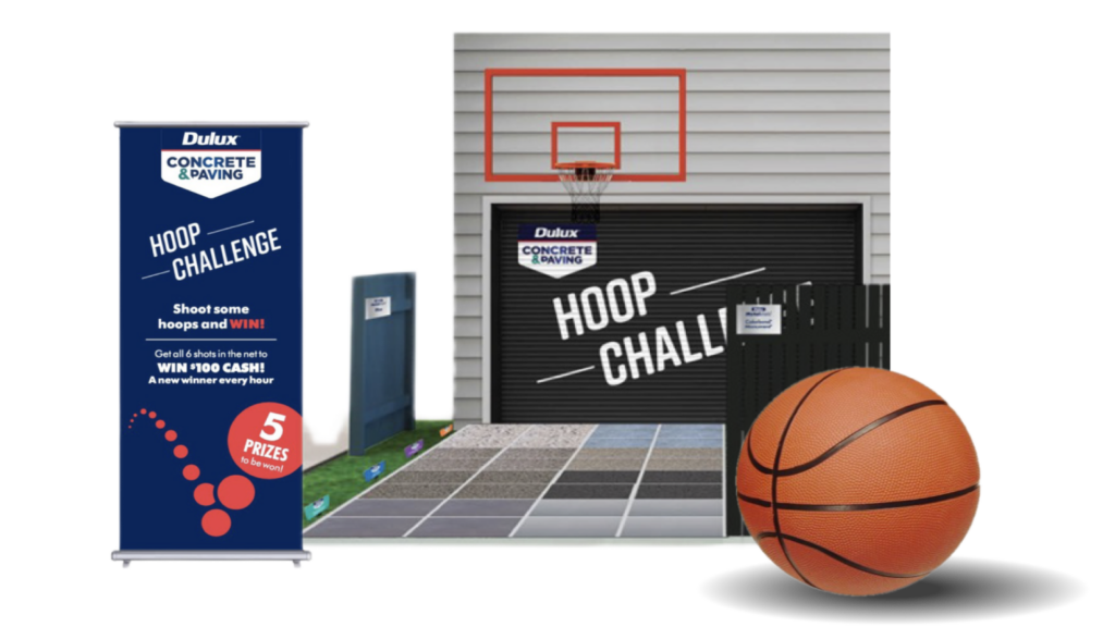
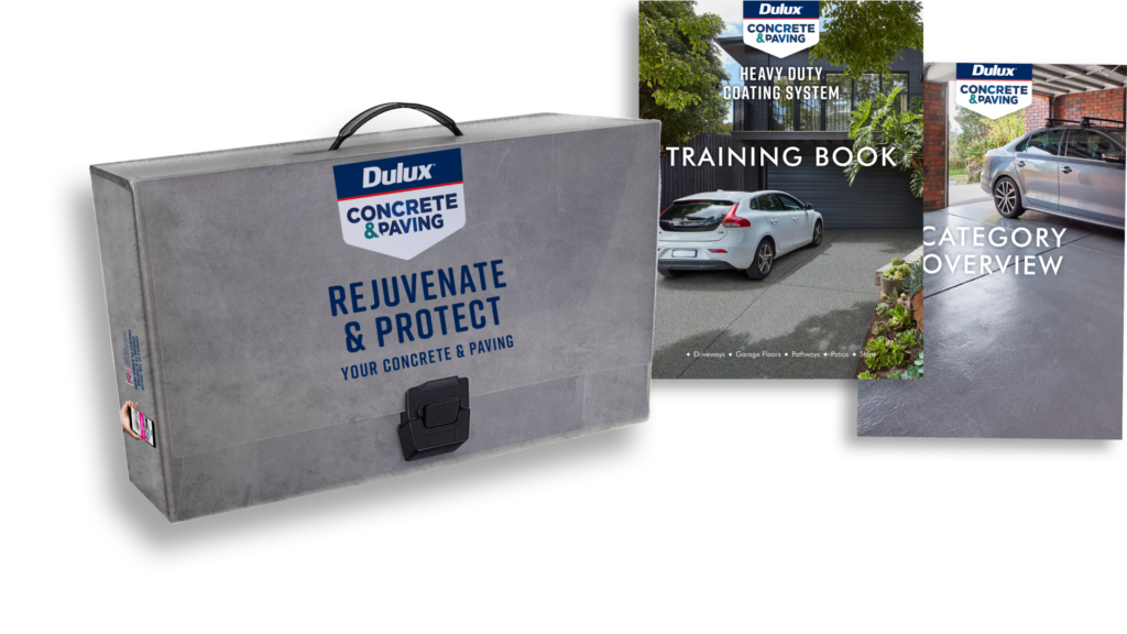
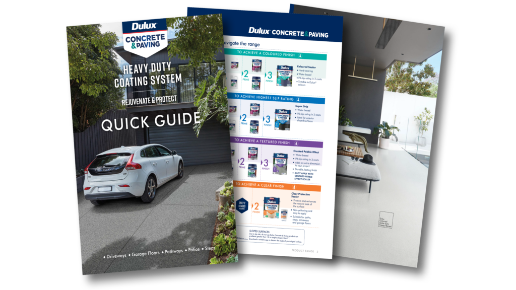
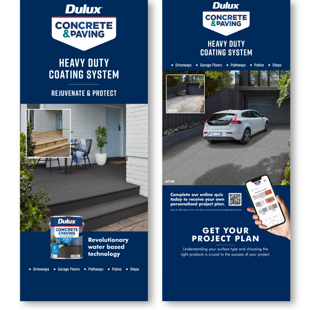
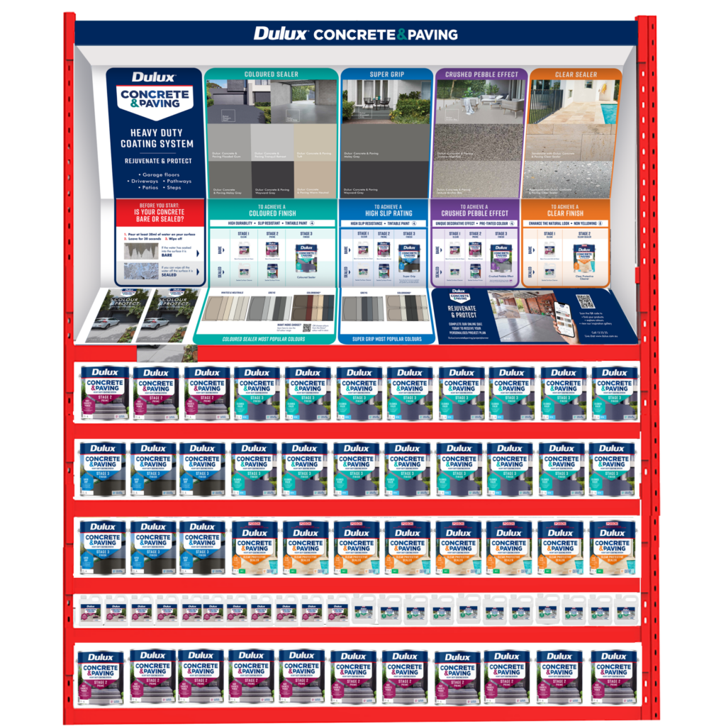
Dulux Concrete & Paving
Paving the way for a revolutionary product.
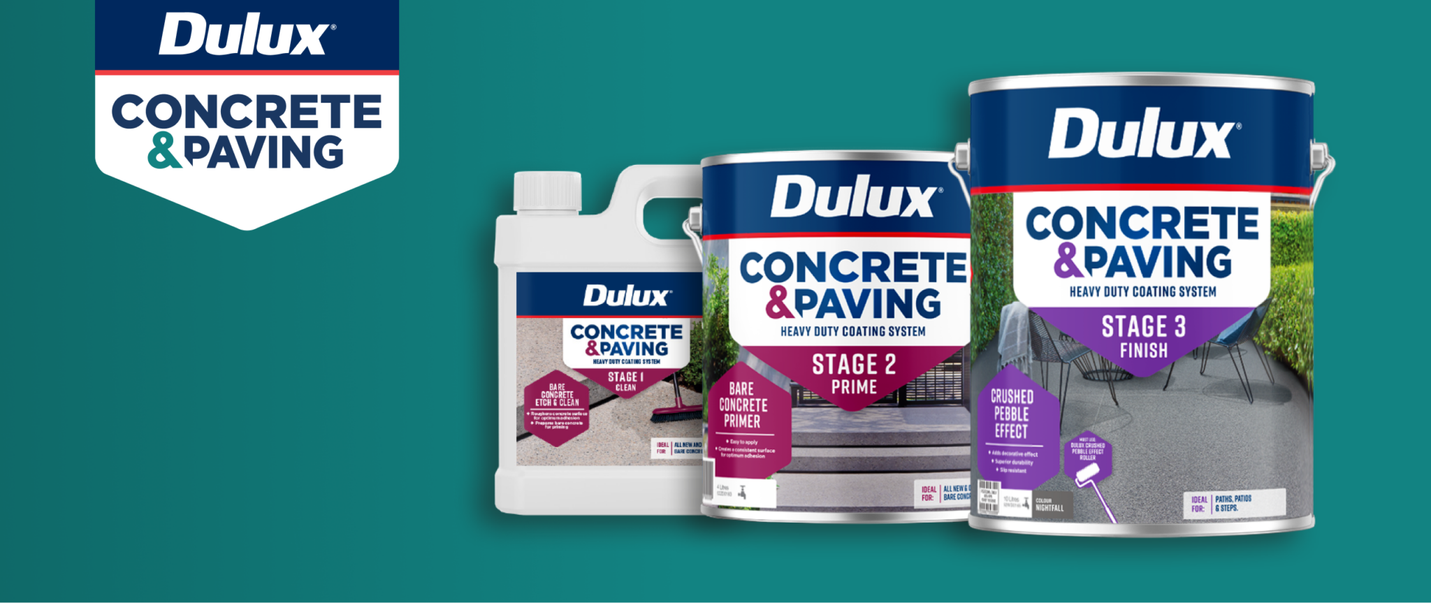
Overview
Dulux was launching the new Concrete & Paving range, encompassing 12 products and a new, revolutionary three-stage system to treat and coat bare concrete and sealed surfaces.
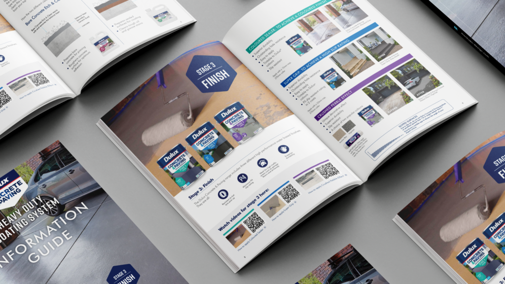
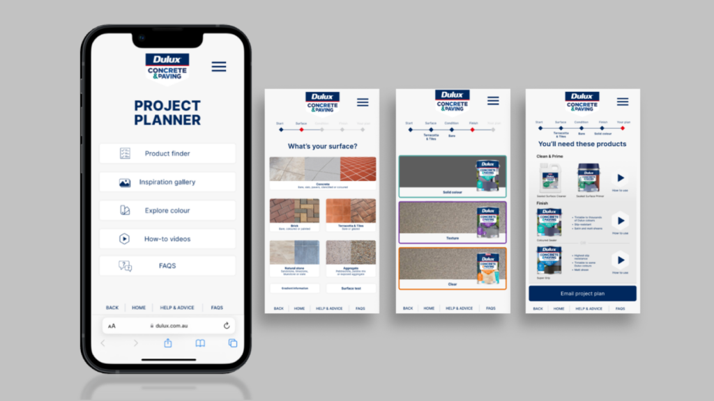
Challenge
The new products were quite technical in nature and application and required a clear and user-friendly communications solution to ensure cut-through and drive engagement with consumers.
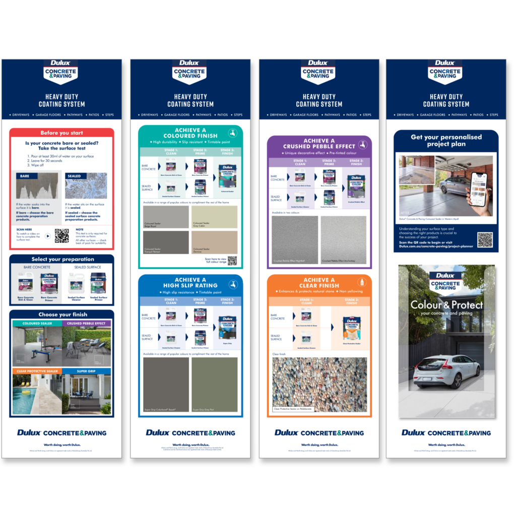
Solution
We launched the range with easy-to-navigate in-store experiences, using colour coding in bays that corresponded with the three stages of the product system. This was leveraged with training materials for Bunnings and IHG staff, ensuring they had the knowledge to guide consumers at the point of purchase.
A key part of the project was the design of a project planner microsite that gave consumers the ability to easily input customised fields to determine their required product. This laddered up to a suite of collateral centred around educating consumers and trade audiences about the range, including ‘how to’ content.
Finally, to gather interest and spark inspiration, we used appealing before and after imagery on promotional material, demonstrating how easy it is to achieve transformational results.
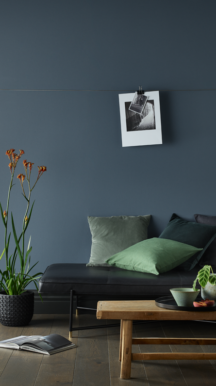
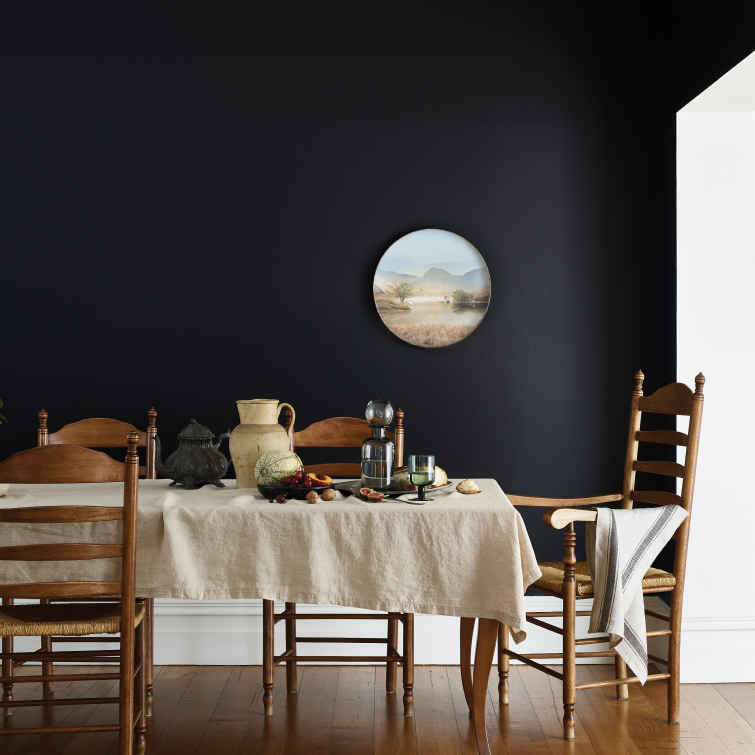
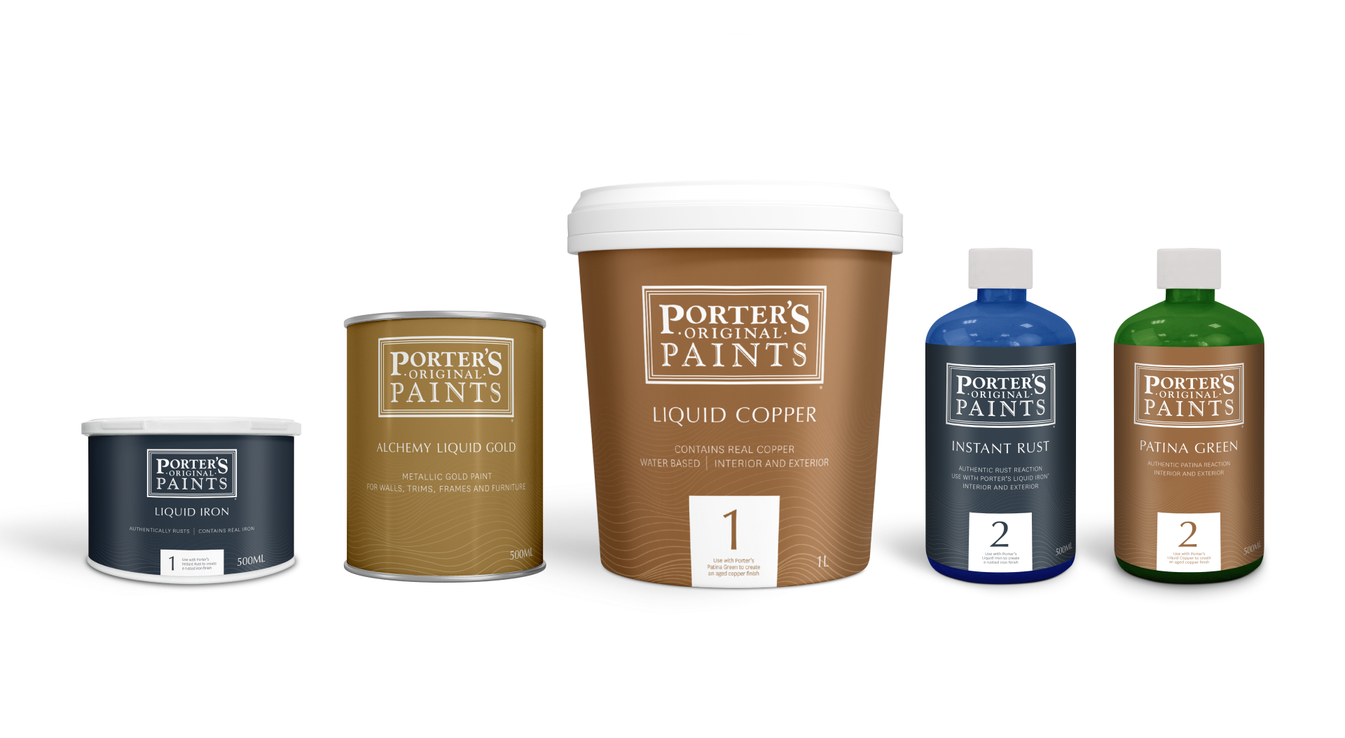
Porter’s
Putting Porter’s on a paint pedestal.
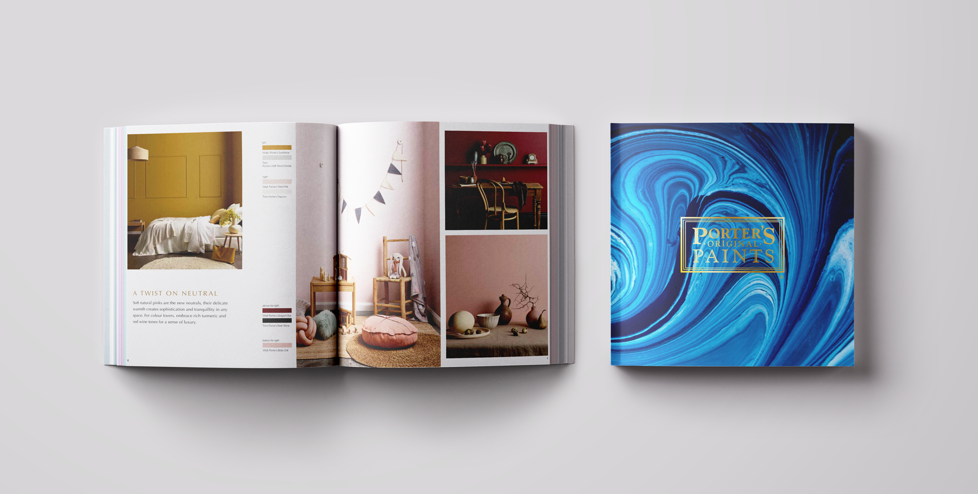
Porter’s needed a packaging refresh and an in-store platform that would generate consumer interest around specialty paints, while driving category cut through. We set to work developing a packaging solution that reflected Porter’s premium credentials and including a brand book, photography and overall brand art direction.

Boost engagement. Build your world.
Overview
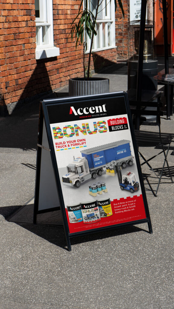
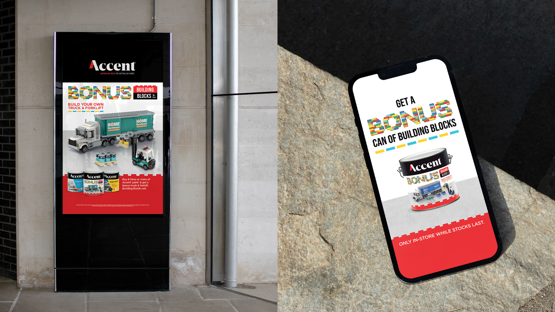
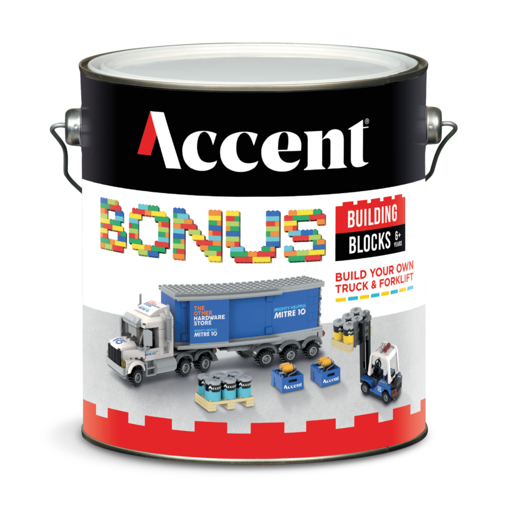
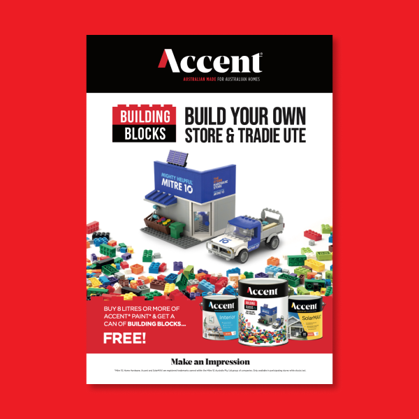
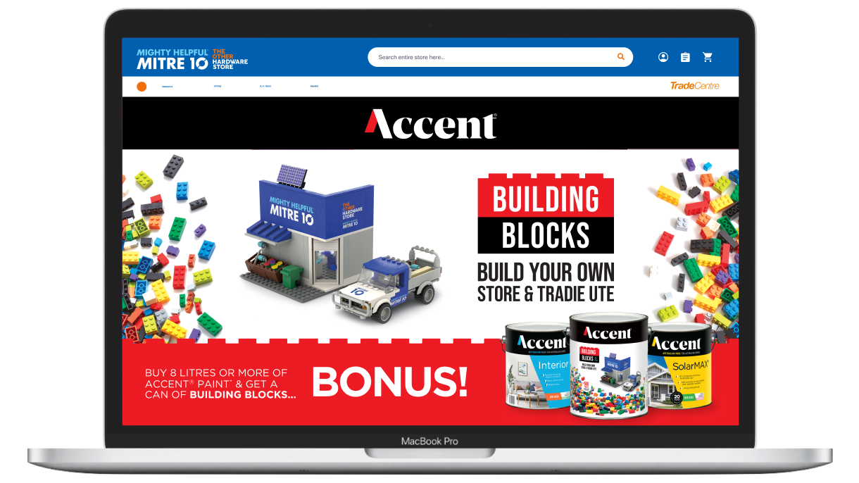
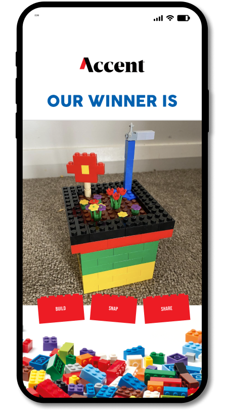
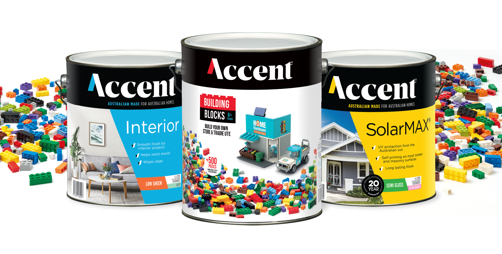
Building on the momentum of the past two years, the 2024 Accent Building Blocks consumer promotion introduced a refreshed and updated look. With the purchase of 8L or more of Accent paint, customers received a bonus set of building blocks, allowing them to create their very own mini Mitre10 and Home Hardware truck and forklift.
Challenge
This year’s Accent Building Blocks promotion targeted young families and last year’s participants eager to expand their collection of mini Mitre10 and Home Hardware models. Our challenge was to revitalize the previous campaign, re-engage last year’s customers, and attract new ones.
Solution
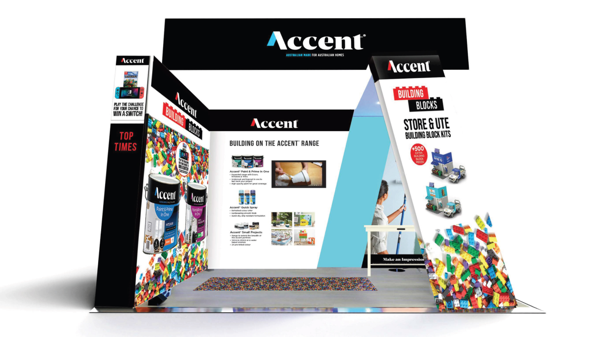
To boost engagement, we amplified the campaign’s digital presence with targeted social media ad and digital marketing, significantly enhancing customer awareness. Complementing this was a comprehensive point-of-sale suite, a robust trade program, and exhibition materials, all designed to inspire more Australians to kickstart their paint projects with Accent.
Accent Blocks 2023
Creating the building blocks to success.
Overview
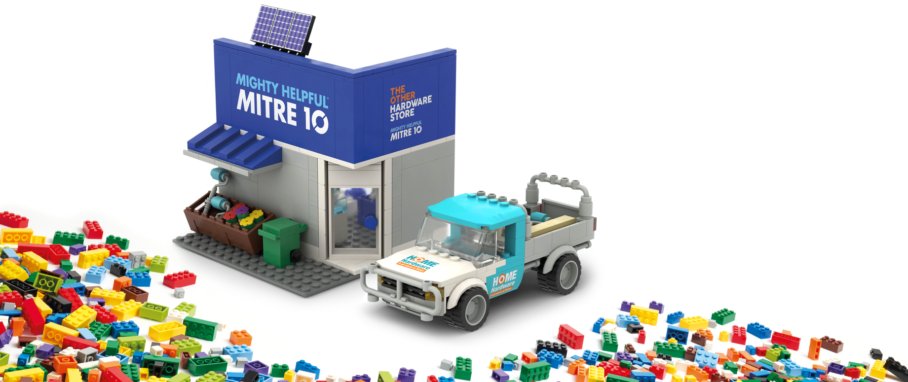
Accent had found major success with their Building Blocks consumer promotion from 2022. They decided to run it again, where customers could receive a bonus can of blocks when they purchased 8L or more of Accent paint.
Challenge
Based on the success of last year’s Blocks campaign, Accent challenged us to go bigger and better.
It had to spark more imaginations, drive more engagement with a broader audience and ultimately inspire more Aussies to start a paint project with Accent.
Solution
The refreshed iteration of the campaign provided the 500 colourful blocks that consumers expected from last year’s promotion. But in order to elevate the campaign, we gave them the chance to build miniature block versions of Mitre 10 and Home Hardware stores.
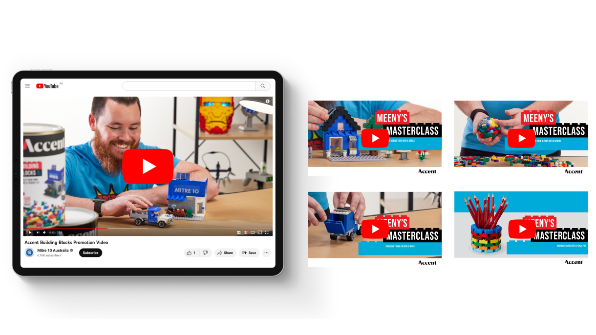
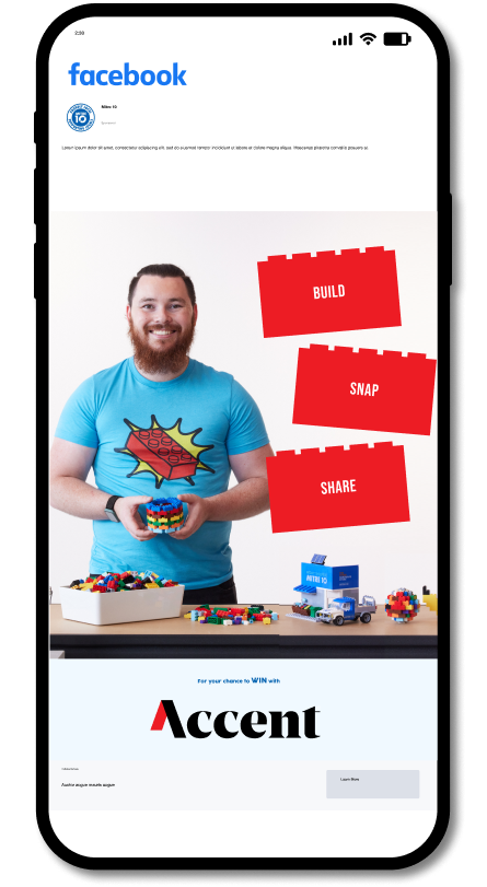
The highly engaging multi-channel campaign was led by Accent ambassador and Block Master, Lewis Meany and featured a comprehensive POS suite, a TVC, a online content series, a user generated consumer promotion, a compelling trade program and more.
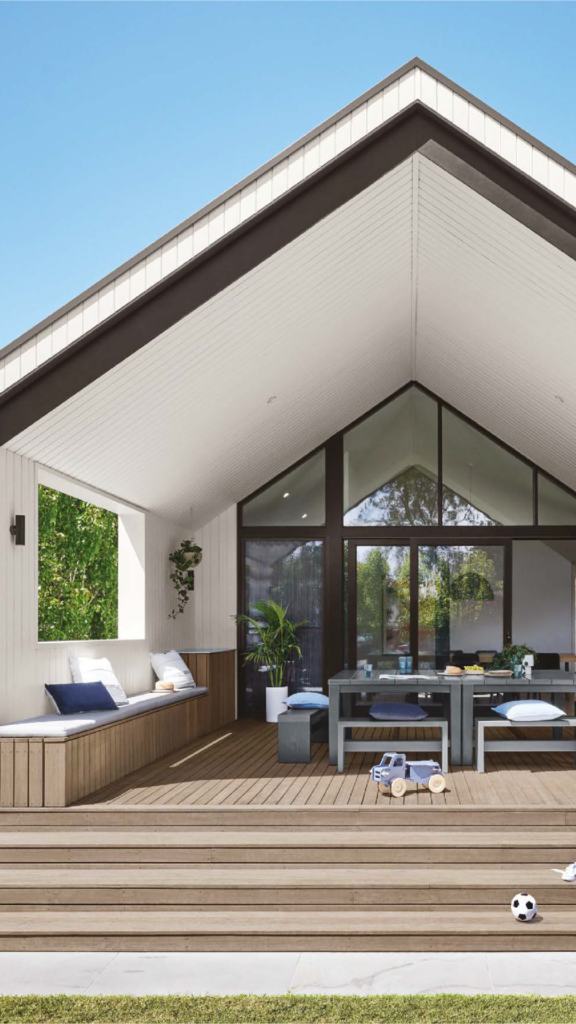
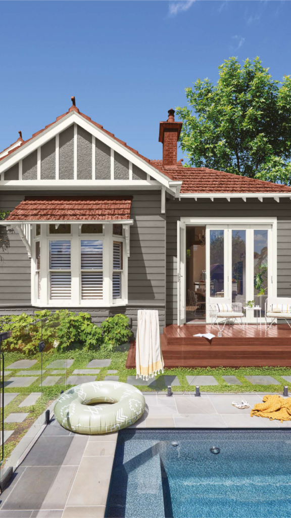
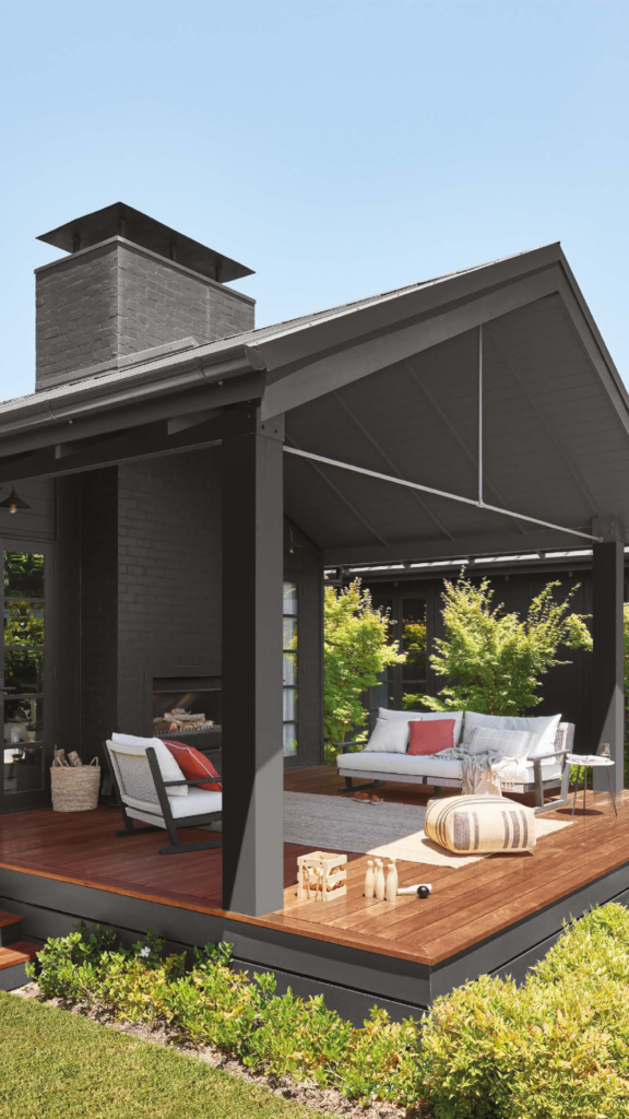
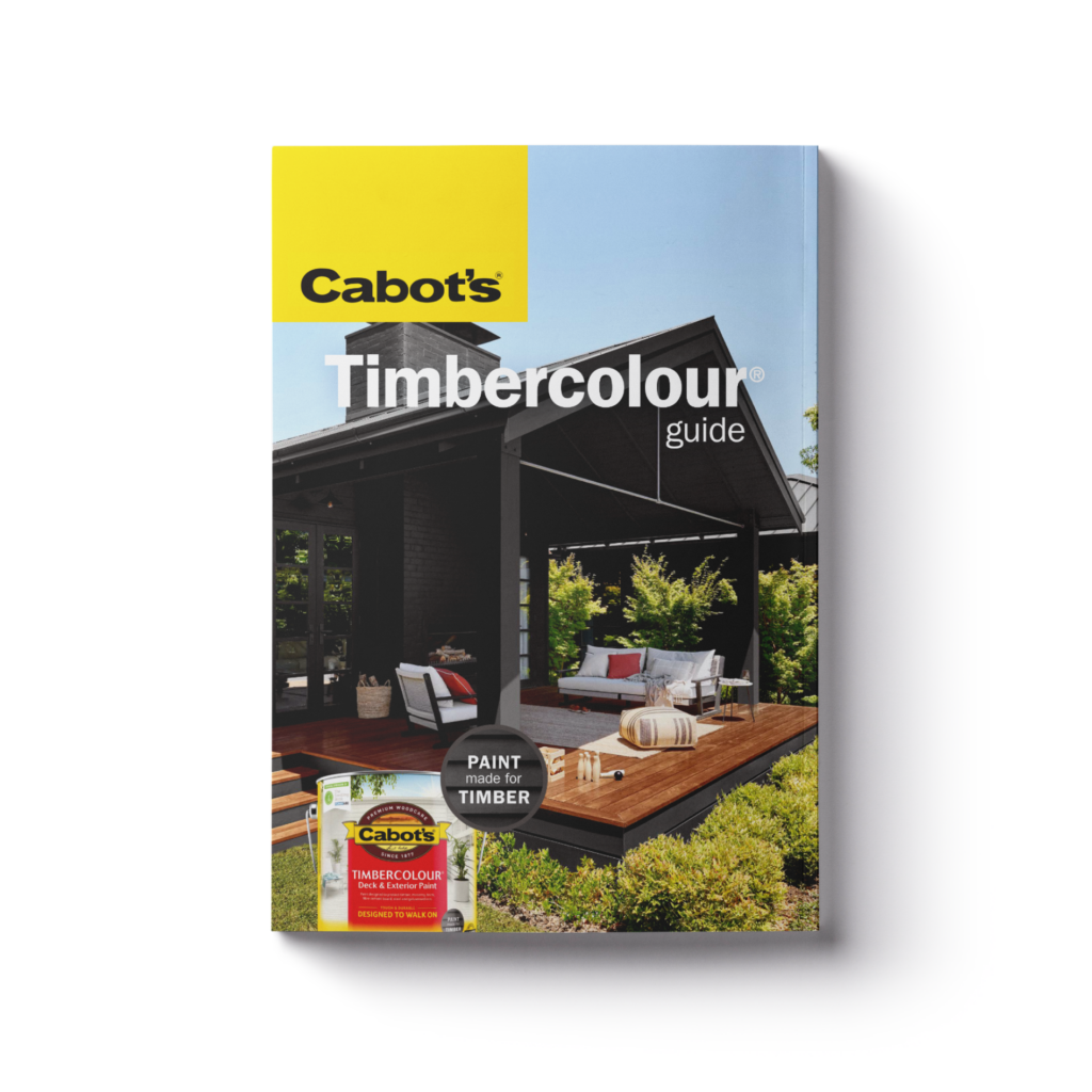
Cabots
Putting the spotlight on Timbercolour.
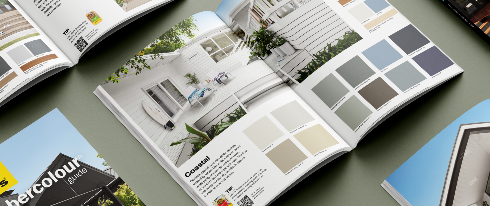
Our task was to effectively communicate the product features and benefits of Cabot’s Timbercolour range, including its durability, protection against the elements, and specific formulation for timber surfaces. The work included a colour card featuring new photography shoot of multiple houses and applications, showcasing the wide range of colours.
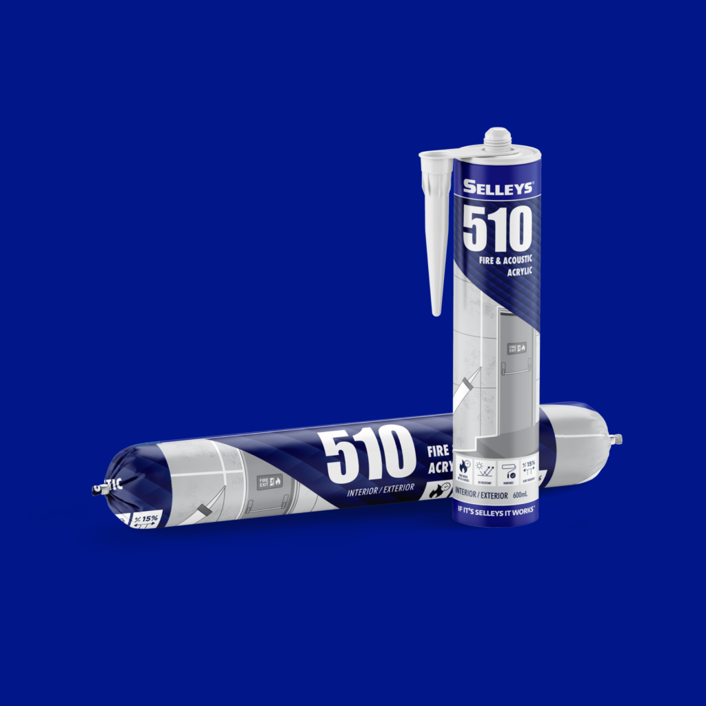
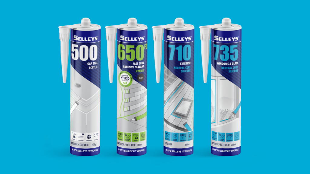
Giving an Aussie icon a global facelift.
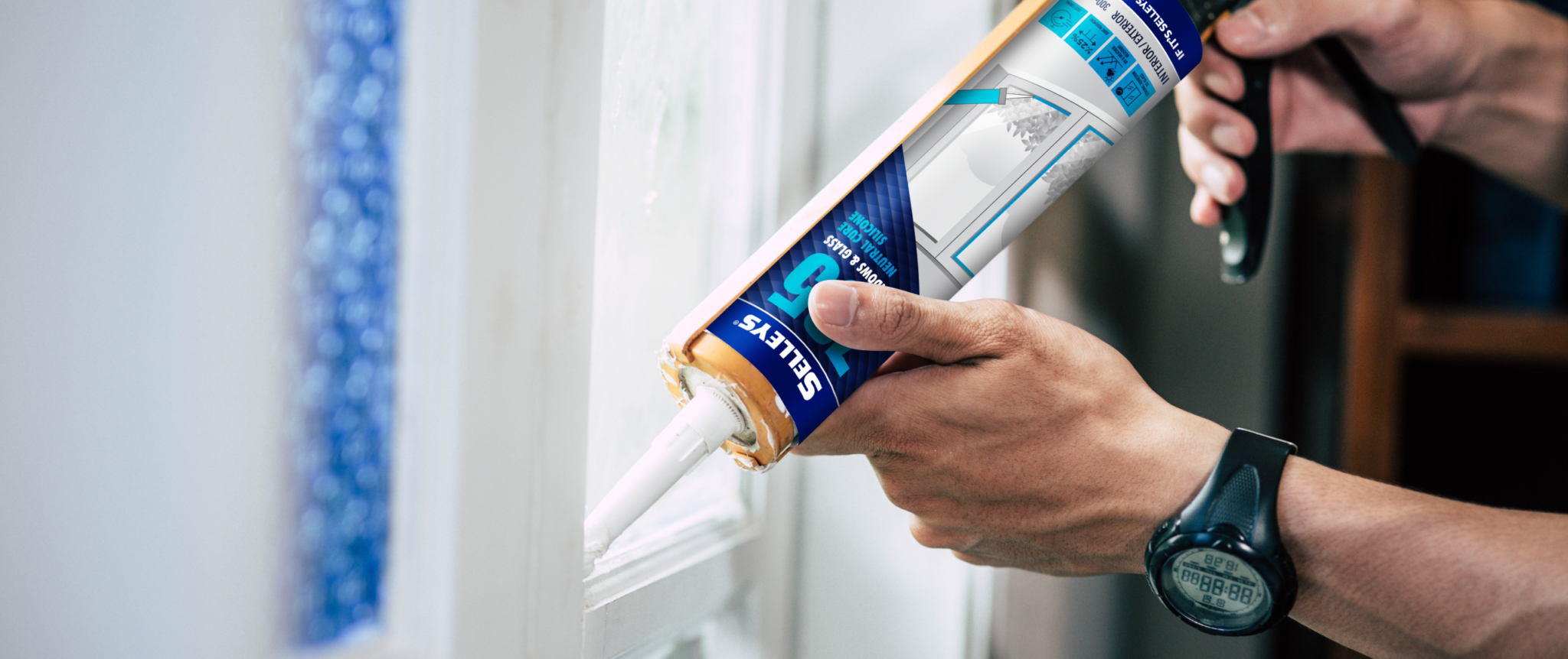
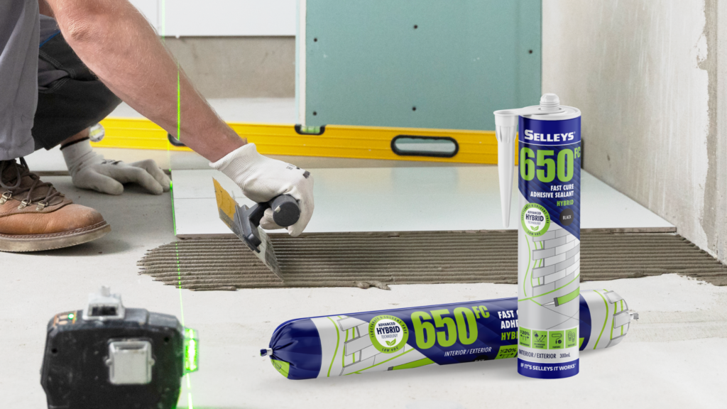
Overview
Established in Sydney in 1939, Selleys is a genuine icon within the professional trade and DIY markets, holding the title as Australia and New Zealand’s number #1 choice when it comes to adhesives, sealants, fillers and paint preparation products.
Challenge
Despite its iconic status and trusted reputation within the trade market across the globe, the previous packaging lacked consistency in the range or brand for the professional user. There was also an issue with overseas markets using the existing ANZ range, which communicated a heavy DIY skew/focus.